Remarks
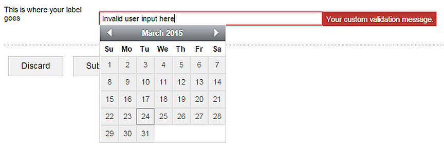
When the datepicker control receives focus, a drop-down calendar is displayed. Users can
select a date by clicking on a day in the calendar, or by entering a string that conforms to
the dateFormat.
The date property evaluates to NULL if the
user input in the datepicker control cannot be parsed as a date.
The dateFormat field may only contain tokens related
to the date pattern: yyyy or yy for the year portion,
MM or M for the month portion, and dd or
d for the day portion, optionally separated by one or more string
literals.
The datepicker control's date always has
00:00:00 set as the time.
If the input in the control does not parse as a date with the
format specified in the dateFormat field, the validation message specified in
the invalidDateMessage is displayed next to the control, and included in the
validation summary.
You can combine the date property of a
datepicker control and the seconds property of a
timepicker control to put together a complete dtl value by
passing the properties to the ADDSECOND()
function.
...
<datepicker id='datepicker'
  label='This is where your label goes'
  date='{(dtl 2015-03-30T00:00:00)}'
  dateFormat='(dtf yyyy "-" MM "-" dd)'
  invalidDateMessage='Your custom validation message.'/>
<chapter title="Combining a datepicker
                and a timepicker
                for a complete datetime value">
  <timepicker id="timepicker"
    label="Timepicker label here"
    invalidTimeMessage="That doesn't make sense."
    timeFormat='(dtf HH":"mm)' step="15"/>
  <textview text='{FORMATDTL(
                  (ADDSECOND(datepicker.date,timepicker.seconds)),
                  (dtf yyyy"-"MM"-"dd" "HH":"mm))}'/>
</chapter>
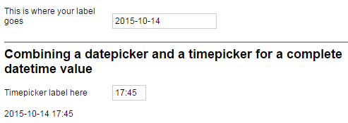
Figure 232. The textview in the screenshot displays the combined date that the
user selected in the datepicker and the
timepicker
Sample
<form id='datepickerSample'
  menuName='A sample datepicker'
  platforms='web'
  xmlns="http://schemas.mobilengine.com/fls/v1">
  <datepicker id='datepicker'
    label='This is where your label goes'
    date='{(dtl 2015-03-30T00:00:00)}'
    dateFormat='(dtf yyyy "-" MM "-" dd)'
    width='30 em'
    invalidDateMessage='Your custom validation message.'/>
</form>
This
datepicker control displays a custom error message when the output does not
conform to its dateFormat
A workflow script running in the Mobilengine Cloud would access the submission of the webform above in the format below:
{...
  datepicker: {date: 2015.10.14. 0:00:00 (Dtl)},
...}
See the workflow script reference guide for more details on data type mapping.