The Mobilengine Box Model
Mobilengine styles are similar to CSS in that they share the so-called box model as the
basis of laying out and rendering elements. The user interface is rendered as a series of
rectangular boxes that contain one another: outermost is the form canvas
that contains a box for each control, which in turn contain specific control parts such as
label and control as boxes. Controls that contain other
controls (think chapter or table) open a new
canvasJust like in CSS, each rectangular box in the hierarchy is further
made up of boxes nested in one another. These have the same names as their CSS counterparts,
and their order, going from outside in: margin, border, padding, and content.
To demonstrate the boxes and how they're nested, consider the following form with four
textview controls: each control is assigned a different style, that is, a
collection of styling options, using the style attribute, which must
contain a reference to a style defined in the solution stylesheet to
work.
<form id='boxModel'
  menuName='The Mobilengine Box Model'
  platforms='ios web'
  xmlns='http://schemas.mobilengine.com/fls/v2'
  menuOrder='1'>
  <textview label='Warmduscher'
    text='Zebrastreifenbenutzer'
    style='{styles.One}'/>
  <textview label='Jeansbügler'
    text='Handschuchschneeballwerfer'
    style='{styles.Two}'/>
  <textview label='Gurtanschnaller'
    text='Chefwitzlacher'
    style='{styles.Three}'/>
  <textview label='Schattenparker'
    text='Turnbeutelvergesser'
    style='{styles.Four}'/>
</form>
The weird German words come from a list of words describing supposedly unmanly behavior types. Learning German is fun.
All stylesheets are text files with the .syl extension, and have the
styles {} object as their root that contains one or more
stylename-of-style{} objects. These are the
collections of styling options mentioned earlier. The style objects are
themselves made up of element-name{} objects that specify the formatting for one or more controls
or form elements that you apply the given style to in your form.
It sounds more complex than it really is. If you're even slightly familiar with CSS, the
only interesting bit is that the style option tags use camel case, and that vaélues are
assigned using the =
sign.
styles
{
  style One
  {
    textview
    {
      borderWidth
      {
        top = 2px
        right = 0px
        bottom = 2px
        left = 0px
      }
      borderColor = 000000
      padding
      {
        top = 4px
        right = 6px
        bottom = 4px
        left = 6px
      }
      margin
      {
        top = 8px
        right = 0px
        bottom = 0px
        left = 0px
      }
    }
  }
  style Two
  {
    textview
    {
      borderWidth
      {
        top = 4px
        right = 0px
        bottom = 4px
        left = 0px
      }
      borderColor = ff0000
      padding
      {
        top = 6px
        right = 4px
        bottom = 6px
        left = 4px
      }
      margin
      {
        top = 5px
        right = 0px
        bottom = 0px
        left = 0px
      }
    }
  }
  style Three
  {
    textview
    {
      borderWidth
      {
        top = 5px
        right = 6px
        bottom = 7px
        left = 8px
      }
      borderColor = bebebe
      padding
      {
        top = 5px
        right = 20px
        bottom = 5px
        left = 20px
      }
      margin
      {
        top = 15px
        right = 0px
        bottom = 0px
        left = 0px
      }
    }
  }
  style Four
  {
    textview
    {
      borderWidth
      {
        top = 4px
        right = 4px
        bottom = 4px
        left = 4px
      }
      borderColor = 0000ff
      padding
      {
        top = 20px
        right = 30px
        bottom = 20px
        left = 30px
      }
      margin
      {
        top = 20px
        right = 0px
        bottom = 0px
        left = 0px
      }
    }
  }
...
}
So
there's four style objects in the stylesheet, which might seem a lot to
begin with, but all four are basically the same collection with tweaked values. All four
manipulate the same formatting options of the same textview control:
Whatever formatting option a style object doesn't explicitly specified
will be overridden by the default value for that option. More on defaults later.
Each style object is linked to one of the textviews in
the form, so when you save the stylesheet and the form above and publish, this is what you
will see on your device.
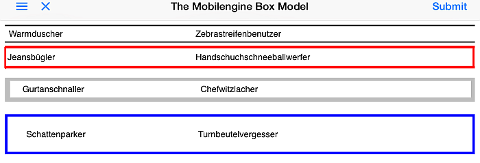
The distance between the textview controls (their margin) varies, and
so does the width and color of their borders. The text in the controls is also at varying
distances from the border inside the textviews, which is what the padding
determines.
So far so good, right? No real biggies here - let's move on.
Controls, control parts, control children
Your style objects so far have a nested object with the name of a form
element, and apply a number of formatting options to it. It all seems crystal clear, but
there are a number of complicating factors that in fact make your job easier or widen your
range of styling options. The whole things is summarized in a handy diagram.
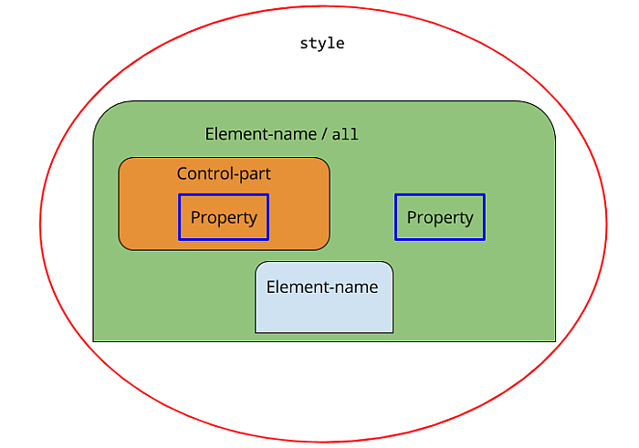
First of all, you don't need to explicitly list all the controls in your form just to
override their defaults and apply the same formatting to each one. By using the
all wildcard (line 21 in the stylesheet below), you can specify the same
formatting options (called 'properties') for each control or control part within an element
in a single swoop.
That brings us to the second interesting feature: controls are made up of
control parts such as label and the control itself, among
others. You can take granular control of the distinct parts that make up a particular
control in your forms: in the example stylesheet below, both the First and
Second style definitions specify different properties for the
label and the control within nested
textviews. If you want to style an element as a single unit, just include
the properties as direct children of the element - this is what happens to the
numberbox control in lines 6-9 below.
The third and perhaps most interesting feature of Mobilengine styling
syntax is the existence of special properties, such as content in line 16
below, that are only available for certain types of form elements (you can only specify
content for controls with child controls, for example), and that must
always point to one (or more) other
style definitions instead of being nested collections of further
properties.
You'll find out about all the other special pointer-only properties when you format table controls in the following sections.
styles
{
...
  style Chapter
  {
    numberbox
    {
      backgroundColor = ff6e4a
    }
    chapter
    {
      title
      {
        backgroundColor = ff0000
      }
      content = chapterContent
    }
  }
  style chapterContent
  {
    all
    {
      backgroundColor = 00000014
    }
    textbox
    {
      margin
      {
        top = 20px
        right = 30px
        bottom = 20px
        left = 30px
      }
    }
  }
  style First
  {
    textview
    {
      control
      {
        borderWidth
        {
          top = 2px
          right = 0px
          bottom = 2px
          left = 0px
        }
        borderColor = 000000
        padding
        {
          top = 4px
          right = 6px
          bottom = 4px
          left = 2px
        }
        margin
        {
          top = 8px
          right = 0px
          bottom = 0px
          left = 0px
        }
      }
      label
      {
        borderWidth
        {
          top = 5px
          right = 0px
          bottom = 2px
          left = 0px
        }
        borderColor = 7fff00
        padding
        {
          top = 4px
          right = 6px
          bottom = 4px
          left = 6px
        }
        margin
        {
          top = 1px
          right = 0px
          bottom = 0px
          left = 0px
        }
      }
    }
  }
  style Second
  {
    textview
    {
      control
      {
        borderWidth
        {
          top = 4px
          right = 8px
          bottom = 4px
          left = 8px
        }
        borderColor = ff0000
        padding
        {
          top = 6px
          right = 4px
          bottom = 6px
          left = 16px
        }
        margin
        {
          top = 5px
          right = 0px
          bottom = 0px
          left = 0px
        }
      }
      label
      {
        borderWidth
        {
          top = 0px
          right = 0px
          bottom = 0px
          left = 0px
        }
        borderColor = 00ff00
        padding
        {
          top = 1px
          right = 5px
          bottom = 1px
          left = 5px
        }
        margin
        {
          top = 3px
          right = 0px
          bottom = 0px
          left = 0px
        }
      }
    }
  }
}
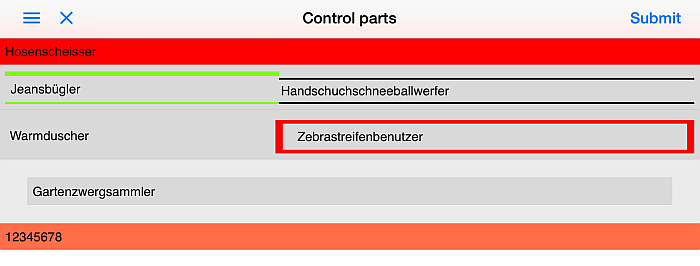
The
associated form references the Chapter style definition in its root
element, so all the controls will have their listed defaults
overwritten.
<form id='controlParts' menuName='Control parts' platforms='ios web' xmlns='http://schemas.mobilengine.com/fls/v2' menuOrder='2'style='{styles.Chapter}'> <chapter title='Hosenscheisser'> <textview label='Jeansbügler' text='Handschuchschneeballwerfer' style='{styles.First}'/> <textview label='Warmduscher' text='Zebrastreifenbenutzer' style='{styles.Second}'/> </chapter> <numberbox number='{TOINT("12345678")}' numberFormat='{decimalSeparator:"."}'/> </form>
Save
the stylesheet and the form, and publish as usual, then open on your mobile device. The left
and right parts of the textviews are displayed differently, the
textbox plays by its own rules, and so do the chaptertitle and the numberbox as a whole at the bottom.
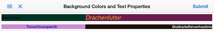
Background colors and text
You've been coloring backgrounds and borders like there's no tomorrow, but so far only using a straightforward hexadecimal representation of RGB color codes (such as in line 7 below). The styling language accepts comma-separated non-hexadecimal RGB codes as well (see line 14 below), and hexadecimal RGBA codes too, so you can go ahead and create semi-transparent backgrounds (see line 33 in the stylesheet excerpt below).
Form styling wouldn't be complete without text formatting options: the styling language supports
All of the above have been put to good use in the over-the-top-formatted little demonstration form and its stylesheet.
style Text1
  {
    textview
    {
      control
      {
        backgroundColor = 6b1d51
        fontSize = 1.8 em
        italic = true
        fontColor = ffa500
      }
      label
      {
        backgroundColor = 0, 53, 38
        fontSize = 0.8 em
        underline = true
      }
    }
  }
  style Text2
  {
    textview
    {
      control
      {
        backgroundColor = 32, 18, 9
        fontColor = ffffff
        strikethrough = true
        textAlign = right
      }
      label
      {
        backgroundColor = 92099978
        textAlign = center
        bold = true
        fontColor = 202dc0
      }
    }
  }
<form id='text'
  menuName='Background Colors and Text Properties'
  platforms='ios web'
  xmlns='http://schemas.mobilengine.com/fls/v2'
  menuOrder='3'>
  <textview label='Waldeinsamkeit'
    text='Drachenfutter'
    style='{styles.Text1}'/>
  <textview label='Torschlusspanik'
    text='Bratkartoffelverhaeltnis'
    style='{styles.Text2}'/>
</form>
but because their control parts have been styled quite differently, the effect is a bit like looking at a two-column two-row table. Save, publish, and observe.