Even the basic styling options that you saw in the previous section can make a form easy on the eyes, but the best formatting helps the user in some way. The techniques you'll pick up in this section all make the job of using the forms you apply them to easier.
Alternate row colors and varying column widths guide the user's eyes and help make sense of tables, highlighting a selected option provides feedback and helps prevent errors, and the rationale behind aligning elements that belong together is kind of obvious.
This is what you'll be getting into below.
Alternating row colors in table controls
The styling options you've seen and applied in the previous section have all been static, that is, once you set them, the formatting options cannot change. Alternating row coloring in tables on the other hand need to be dynamic, because you never know how many rows the table will have, and you'll want to re-color some or all of the rows when rows are removed.
You'll take the syln="row" style with the light-green background from
earlier, and apply it to every second row in the contact list. You'll apply another row
style to the rows in between in the contactsTable dynamic list control,
based on the index of the generated row.
The code below assumes that you have not modified the styles featured in the previous version of the form. If you have tweaked the formatting, you'll have to modify some of the code below to fit your design.
...
<Rgsyl>
  <Syl syln="bold"
    fBold="true"
    clrFont="#9C2C2B"/>
  <Syl syln="header"
    fBoldValue="true"
    pctFontSize="130"
    clrBg="#9C2C2B"
    clrFont="#FFFFFF"
    halign="left"/>
  <Syl syln="row1"
    clrBg="#34A0E8"
    clrFont="#FFFFFF"
    duPaddingTop="2pt"/>
  <Syl syln="row2"
    clrBg="#124669"
    clrFont="#FFFFFF"
    duPaddingTop="2pt"/>
  <Syl syln="Address1"
    clrBg="#34A0E8"
    clrFont="#FFFFFF"
    fItalicValue="true"
    halign="right"
    duPaddingTop="2pt"/>
  <Syl syln="Address2"
    clrBg="#124669"
    clrFont="#FFFFFF"
    fItalicValue="true"
    halign="right"/>
</Rgsyl>
...
  <Control name="contactsTable"
    type="panel"
    layout="table"
    navigation="inline"
    data_type="string, string, string, string, string, string"
    generator="SELECT id, name, phone, category, address, mail
              FROM Reference_contact
              WHERE name LIKE @1 || '%'
              ORDER BY CASE WHEN @2 ='Name' THEN name
              WHEN @2 ='Category' THEN category END"
    ref_arg="../searchbox,../orderBySegment"
    sylnRow="SELECT CASE WHEN @1 % 2 = 0 THEN 'row1' ELSE 'row2' END"
    sylnargRow="SELF.igp"
    sylnCrown="=header">
...
    <Control name="columnAddress"
      type="textbox"
      label="Address"
      reference="SELECT @1"
      ref_arg="PARENT.col4"
      sylnCrown="SELECT CASE @1 % 2 WHEN 0 THEN 'Address1' ELSE 'Address2' END"
      sylnargCrown="PARENT.igp"/>
...
The
two alternating row styles are named row1 and row2, and
they differ only in their background color. However, because you formatted the Address column in the table different than the rest, you'll need to declare an alternate row style for the
columnAddress column, and apply it based on the same query that the
parent control uses. Otherwise, your Address column would not match
the rest of the table.
The igp property, a
continuously updating zero-based index of the rows generated in a dynamic list control is
the key to dynamic styling. To access the index number, you can think of it as an implied
extra column running along the side of the rows that the dynamic list control generates.
Since dynamically generated rows are a moving target, most likely you'll use
PARENT.igp or SELF.igp to reference the index number of
rows.
The actual query statement in contactsTable and
columnAddress tests whether the index of the row is even or odd with the
modulo operator, and assigns one or the other row style accordingly.
Save as contacts.form.xml, publish via the mebt,
synchronize, and open the form as usual.
Sweet. Now, let's make the formatting react to user input.
Highlighting the rows that the user selected
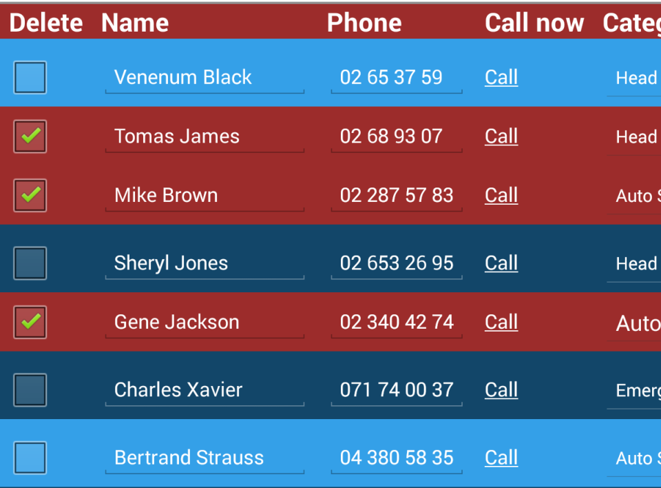
There's a Delete check box next to every name in the list, and if
the user submits the form with one or more of the check boxes selected, the
contactUpdater workflow script (remember the one?) will remove the contacts from the database
without a trace.
Just to be on the safe side and minimize accidental data loss, let's make it obvious to the user that a contact is about to be deleted. The simplest way to go about this is to highlight the selected rows.
The code below uses the singluarly beautiful dark red from the header. Feel free to use a different color in your own code, as long as you green-light it with the Rocky Jupiter people first.
... <Rgsyl> ...<Syl syln="selected" clrBg="#9C2C2B" clrFont="#FFFFFF" duPaddingTop="2pt"/>...<Syl syln="selectedAddress" clrBg="#9C2C2B" clrFont="#FFFFFF" fItalicValue="true" halign="right"/></Rgsyl> ... <Control name="contactsTable" type="panel" layout="table" navigation="inline" data_type="string, string, string, string, string, string" generator="SELECT id, name, phone, category, address, mail FROM Reference_contact WHERE name LIKE @1 || '%' ORDER BY CASE WHEN @2 ='Name' THEN name WHEN @2 ='Category' THEN category END" ref_arg="../searchbox,../orderBySegment"sylnRow="SELECT CASE WHEN @2 THEN 'selected' WHEN @1 % 2 = 0 THEN 'row1' ELSE 'row2' END" sylnargRow="SELF.igp,./deleteContact" sylnCrown="=header"> ...<Control name="columnAddress" type="textbox" label="Address" reference="SELECT @1" ref_arg="PARENT.col4" sylnCrown="SELECT CASE WHEN @2 THEN 'selectedAddress' WHEN @1 % 2 = 0 THEN 'Address1' ELSE 'Address2' END" sylnargCrown="PARENT.igp,../deleteContact"/>...
Lines
25-27 is where the money is: the new syln="selected" formatting element
(declared in lines 4-6) is applied to the generated child elements of
contactsTable if the deleteContact check box control
evaluates to true. The rest of the query statement stays the same, effectively setting up an
if - else if - else statement.
Note that for the first time in your Mobilengine development history, on line 28, you're
moving downwards instead of upwards in the control hierarchy to reference another control,
so you're putting ./ instead of ../ into the relative
path. Finally.
You don't want to leave the Address column behind, so you'll need a
selectedAddress style that retains the italics and the right-alignment of
the Address column even inside a selected row. You also need to
basically re-create the contactsTable query statement for the address
column (lines 36-38).
Save, publish, synchronize, open, and have fun: light the hapless contacts list up like a Christmas tree.
Controlling the widths of columns in dynamic list controls
The horizontal guides that alternating row colors and highlighting offer can be very effective user experience boosters, but you should not ignore the vertical axis of your lists and tables.
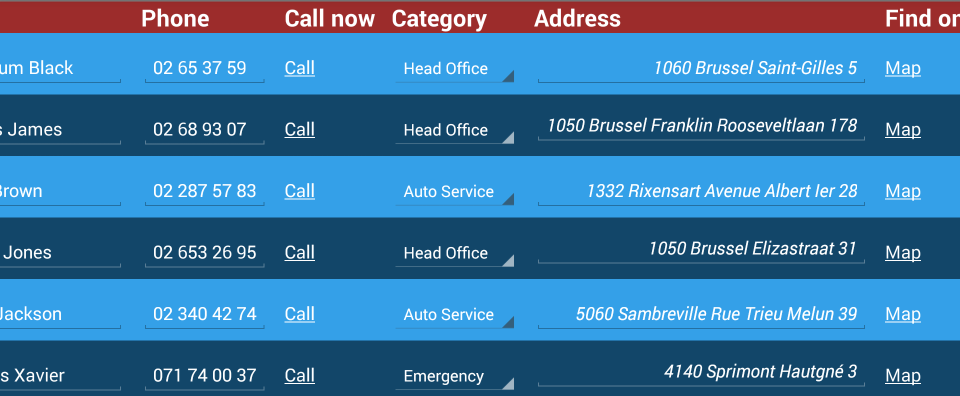
When you have columns spaced at roughly the same distance by default, and one of the columns has relatively short text but a wordy header row, you get a gap. Look at the space between the Call now and the Category columns above. You and your users don't have to put up with such bother any longer.
You've been tasked by your good friends at Rocky Jupiter to style the Vehicle Inspection form you've made for them. It should use the three colors in their logo throughout, and all the tables must have alternating row colors as well as nicely spaced columns.
Put your brand new skills to the test with the following code:
In case this is the
first ever Mobilengine tutorial you're seeing, or you haven't been downloading the
solution artifacts as you've progressed, here's the reference table declaration file for parts.refem
and
vehicles.refem
, plus their input data spreadsheets that the
vehicleInspection.form.xml form
uses.
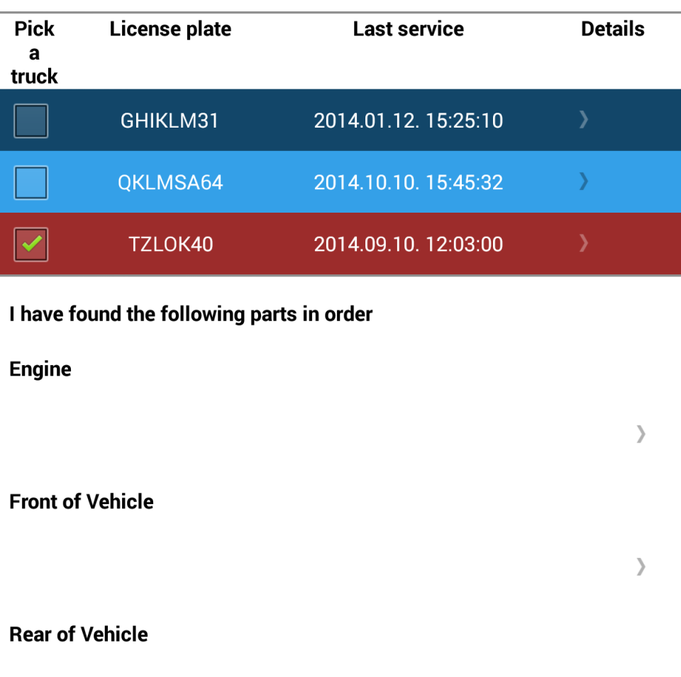
...<Rgsyl> <Syl syln="paddingTop" duPaddingTop="20px"/> <Syl syln="bold" fBold="true" duPaddingBottom="30px"/> <Syl syln="header" fBold="true" halign="center"/> <Syl syln="selected" clrBg="#9C2C2B" clrFont="#FFFFFF" halign="center"/> <Syl syln="row1" clrBg="#124669" clrFont="#FFFFFF" halign="center"/> <Syl syln="row2" clrBg="#34A0E8" clrFont="#FFFFFF" halign="center"/> </Rgsyl><Control type="panel" name="root"sylnChild="=bold"> ... <Control name="vehicleSelection" type="panel" layout="table"table_width="1 swt"navigation="inline"sylnCrown="=header" sylnRow="SELECT CASE WHEN @2 THEN 'selected' WHEN @1 % 2 = 0 THEN 'row1' ELSE 'row2' END" sylnargRow="SELF.igp,./selectTruck"data_type="string, string, string, string, string, string, string, string, string, string, string, string, string" generator= "SELECT driver, nfc_tag, barcode, plate, make, model, year, color, engine, fuel, transmission, drivetrain, last_service FROM Reference_vehicles WHERE driver=@user"> <Control name="selectTruck" type="checkbox"width="remaining 1"label="Select a truck"/> <Control name="License_plate" type="label"width="remaining 3"label="License plate" text="License plate" reference="SELECT @1" ref_arg="PARENT.col3"/> <Control name="Last_Service" type="label"width="remaining 4"label="Last service" reference="SELECT @1" ref_arg="PARENT.col12"/> <Control name="detailsPopup" type="panel" navigation="popup"width="remaining 2"layout="standard" label="Details"> ... <Control>
The
alternating row colors and the selection highlighting in the
vehicleSelection table use the very same ideas that you learned about
when styling the contacts list.
The magic words for column spacing are
table_width and width="remaining <number>".
You put the former in the table control and set it to a fixed number or, as in the case
above, the full width of the screen that the form is opened on (1 swt).
Floating point values are also completely legal with the swt unit, and
will be evaluated as a percentage of the full width of the current device screen. See the reference on element width for details.
Then, you give each of the columns of the table a share of that width by assigning an
integer or floating point ratio using the remaining keyword.
Save, publish, and open your cool new form on your Android device.
If no delivery
tasks show up on your device, the reason might be that the assignments
reference table does not contain the user account that you're logged in with. The
hassle-free solution is to modify your username to
petar.hoyt@gmail.com on the Users tab of
the Backoffice site.
That's really nice, but the Jupiter team explicitly said they want the whole form
styled, not just the truck selection bit. Turn those vehicle region popup groups red and
blue.
My first headless table - aligning controls horizontally
You could just go and assign a Syl to the vehicle region label and the
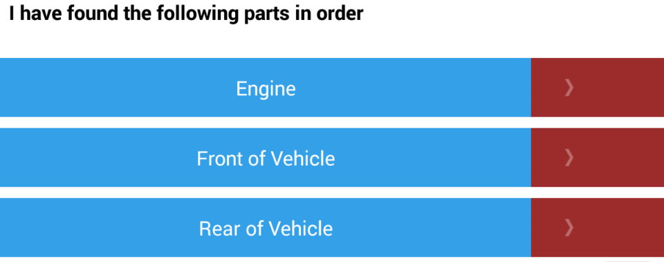
popup that takes the user to the segmented controls, but that would be disastrous, as the screenshot below illustrates.
What went wrong? Well, you might have noticed in the screenshot above that the
Engine, Front of Vehicle labels and the
popup link arrows do not line up. This is because you can't help but put one first and the
other second inside the popupGenerator dynamic list control parent. Even if
you assign the label 80 per cent of the screen space (0.8 swt) to the label
control to compensate, the misalignment is noticeable, and a background color makes it
glaringly obvious.
Enter the headless="true" table control attribute. With a headless table, you can make two or more controls line up as if they were a single row in a table without the side effect of having a header. It's a convenient method to achieve horizontal alignment between controls that are supposed to line up but don't.
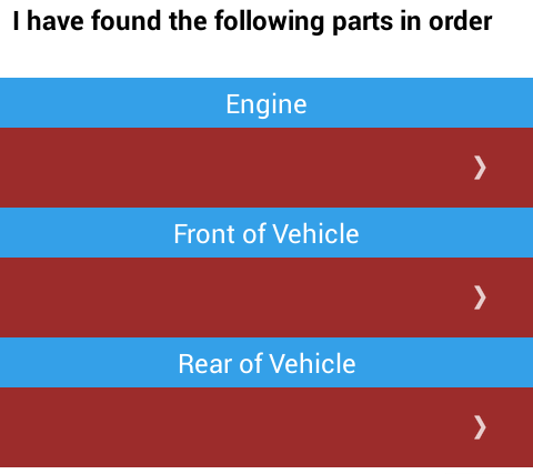
With the headless table tool, there's nothing to stop you from adding the necessary background colors and tweaking the column widths just the way you need them:
... <Control name="popupGenerator" type="panel" layout="standard" navigation="inline" generator="SELECT distinct where_in_vehicle FROM Reference_parts"><Control name="rowWrapper" type="panel" sylnCrown="=paddingTop" layout="table" headless="true" navigation="inline"><Control name="popupLabel" type="label"width="0.8 swt" sylnCrown="=row2"reference="SELECT @1" ref_arg="../PARENT.col0"/> <Control name="Popup" type="panel"width="0.2 swt" sylnCrown="=selected"navigation="popup"> ...</Control>
An
unexpected bonus of having a headless table (rowWrapper) inside a dynamic
list control (popupGenerator) is that if you apply a bit of top padding as
sylnCrown on the headless table control, there'll be a nice separator
between the rows.
The label gets the style of the lighter blue alternating rows from the truck list, and the popup gets the reddish background that highlights a selected truck.
Save, publish, and view on the mobile device as usual. The first screen of the form is now thoroughly lovely.
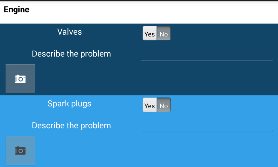
What about the popup screen, though? The user will sooner or later tap the popup link
and see the segmented controls themselves, which are also horribly misaligned, not to
mention their lack of Rocky Jupiter colors. Get them straightened out with the headless
table treatment, and make the background colors alternate nicely.
Another headless table
You're definitely winning against this form. All that's left before you can wrap this up is to make the look of the form consistent by applying some more of the techniques you used so far: put the car part labels and the segmented controls that refer to them into headless tables to align them horizontally, and then style their even- and odd-numbered rows differently with one of the Rocky Jupiter blues.
...
<Control name="Popup"
  type="panel"
  width="0.2 swt"
  sylnCrown="=selected"
  navigation="popup">
  <Control name="popupHeader"
    type="label"
    sylnCrown="=bold"
    reference="SELECT @1"
    ref_arg="../../popupLabel"/>
  <Control name="wrapper"
    type="panel"
    navigation="inline"
    sylnRow="SELECT CASE WHEN @1 % 2 = 0 THEN 'row1' ELSE 'row2' END"
    sylnargRow="SELF.igp"
    generator="SELECT part_name
              FROM Reference_parts
              WHERE required='1'
              AND where_in_vehicle=@1"
    ref_arg="../../popupLabel">
    <Control name="segmentsWrapper"
      type="panel"
      layout="table"
      headless="true">
      <Control name="SegmentedControlLabel"
        type="label"
        width="0.5 swt"
        reference="SELECT @1"
        ref_arg="../PARENT.col0"/>
      <Control name="SegmentedControl"
        type="combobox"
        choice="button"
        width="0.2 swt"
        reference="SELECT 'Yes' UNION ALL SELECT 'No'" >
        <Validators>
          <Validator
            type="RequiredValidator"
            verifyat="submit"
            changeindicator="both"
            message="Please indicate if the listed part is in order."/>
        </Validators>
      </Control>
    </Control>
...
  </Control>
Set
up the sylnRow with the index-checking query statement in the
wrapper panel, home to the segments and the optional submitter panels
below them, so that if the error submitters appear, their formatting will match that of the
segmneted controls above them.
Then, wrap the labels and segmented controls into a warm segmentsWrapper
headless table to make them line up.
You need this extra panel: if you try to make wrapper the headless table,
the submitter panel becomes the third column of the segmentsWrapper
headless table, and the whole layout is off.
Figure 200. Alternating background color for the segmented control rows, and submitter panels that match their parent controls
You can be proud of both the Search the Contacts Database and
the Vehicle Inspection form you were tasked with. The formatting in them
now actually helps the user make sense of and use the forms. Time to tackle the last of the
mobile forms: the dashboard form that you set up for the delivery workflow.

