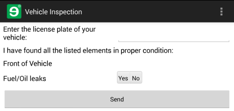
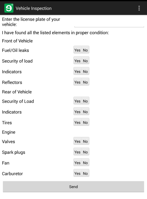
This is what the form that you're creating in this section will look like when you're done.
-
Open
vehicleInspection.form.xmlfrom the previous part of the tutorial, add the following controls to the form after the root panel control, and save the file.<Form name="vehicleInspection" description="Vehicle Inspection" typed="true" dateformat='(dtf yyyy"-"MM"-"dd" "HH":"mm":"ss)' numberformat='{decimalSeparator:"."}'> <Control type="panel" name="root"> <Control type="textbox" name="licensePlate" label="Enter the license plate of your vehicle:"/><Control type="label" name="headerLabel" text="I have found all the listed elements in proper condition:" submit="false"/> <Control type="label" name="frontLabel" text="Front of Vehicle"/> <Control type="combobox" name="leaks" choice="button" label="Fuel/Oil Leaks" reference="SELECT 'Yes' UNION ALL SELECT 'No'"/></Control> </Form>-
The
<Control type="label"/>element is a label control that displays read-only text to the user. Longlabeltext is broken up into multiple lines. -
The
submit="false"attribute specifies that the data in the control will not be sent along when the user submits the form - you can leave out static elements using the attribute to limit the amount of data that you move across the network. -
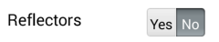
Segmented controls in the mobile form language have a type of
comboboxand require thechoice="button"and areferenceattribute with a data-binding query. For more on this kind of static data-binding query, see the data-binding overview.Mobilengine forms give you several options when you want to present a set of answers for the user to choose from: drop-down, toggle choice, hyperlink choice, and segmented controls. Segmented controls display every selectable answer in a single row, and work best when there are only a couple of choices - ideal for
Yes/Noquestions (See the overview of the finished form). -
controls can have
labelattributes: this is the text that you want to display to the left of the control
-
-
Why not publish the new form and see what your segmented control looks like before you add some more content? Do you still remember how to do that?
c:\RockyJupiter>
mebt run .mobilengine srv 22.0 (Release) v22.0.157.14908 Executing run (compile and deploy to server): Service url: https://tutorial.mobilengine.com/services/comex/v1/ User: petar.hoyt@mailinator.com adding 'vehicleInspection.form.xml' Reset integration settings Import form 'vehicleInspection' Done.After you publish, synchronize your device, and open the form.
-
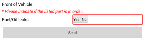
Nice work so far. However, you can't put your feet up yet - you want each of these segmented controls to be mandatory, so that the driver will not be able to submit the form if he or she has not selected either Yes or No. In other words, you need a validator. Add a closing tag to your segmented control element, and insert the following code inside it:
... <Control type="combobox" name="leaks" choice="button" label="Fuel/Oil leaks" reference="SELECT 'Yes' UNION ALL SELECT 'No'"><Validators> <Validator type="RequiredValidator" verifyat="submit" changeindicator="both" message="Please indicate if the listed part is in order."/> </Validators></Control> ...-
There are validators for every kind of user input you could think of, and you can insert more than one at a time: simply list them inside the
Validatorselement. -
The
verifyat="submit"attribute specifies that the validator will alert the user about the control when he or she tries to submit the form - the other available option is to alert the user as soon as he or she modifies the control (verifyat="change"). -
The
changeindicator="both"attribute specifies that not only the alert message is displayed, but the control is circled in red as well. -
The value of the
messageattribute is the alert message that is displayed when the user tries to submit the form without entering input.
If you don't specify a
messageattribute, the default error message Required field. will be displayed.Figure 42. This is how the validator above kicks in when the user tries submitting the form without picking a choice
-
-
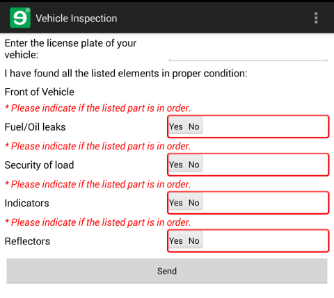
Practice time: in the text editor, add three (3) more segmented controls below the first one, with the same Yes/No choices, and the same
RequiredValidator, labelled Security of Load, Reflectors, and Indicators, and save the file. You can download the file if you want to. -
Save and publish the file as usual. On your phone, fill it in (or don't fill it in, and suffer the consequences), then submit it. Congratulate yourself for a job well done, then move on to the next tutorial.