A typical truck has much more parts than you can list in a form that lives on a mobile device screen. Any of the parts can have problems, and you want to let the Rocky Jupiter truck drivers report all of the problems they find - even if you don't list the problematic part in the form.
The solution is to let the driver add parts to the list that he or she can then report about by sending the form.
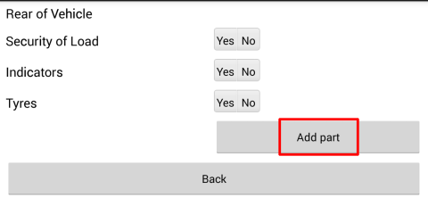
The Add part control that you'll use for this will add or remove the controls that you set up when the user taps it.
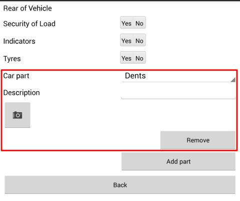
As you can see in the screenshot, a Remove button is automatically generated every time the user taps Add part.
Open the vehicleInspection.form.xml file from before, and add the
following two controls inside each of your popup panels, just before the panel's
closing
tag:
...
<Control
    type="panel"
    name="popupFront"
    navigation="popup"
    label="Front of vehicle">
       ...
    <Control
        type="panel"
        name="reflectorsSubmitter"
        navigation="inline"
        generator="SELECT '' WHERE @1 ='No'"
        ref_arg="../reflectors">
        <Control
            type="textbox"
            name="reflectorsDescription"
            label="Description"/>
        <Control
            type="photo"
            name="reflectorsPhoto"
            allowmultishoot="true"
            proposedresolution="1024x768"
            proposedquality="91"/>
    </Control>

    <Control
            type="panel"
            name="optionalProblemsFront"
            navigation="inline"
            layout="standard"
            count="0">
        <Control
                type="combobox"
                choice="dropdown"
                name="optionalElementDropdown"
                text="Car part"
                reference="SELECT 'Steering wheel'
                          UNION ALL SELECT 'Spare tires'
                          UNION ALL SELECT 'Brakes'
                          UNION ALL SELECT 'Windscreen'"
                value_reference="SELECT 'Steering wheel'"/>
            <Control
                type="textbox"
                name="optionalDescription"
                label="Description"/>
            <Control
                type="photo"
                name="optionalPhoto"
                allowmultishoot="true"
                proposedresolution="1024x768"
                proposedquality="91"/>
        </Control>
        <Control
            type="button"
            name="optionalAddButton"
            text="Add part">
            <Actions>
                <Action
                    type="generator"
                    target="../optionalProblemsFront"
                    removebuttontext="Remove"/>
            </Actions>
        </Control>
...
Study notes:
-
The first panel, named
optionalProblemsis what the user can generate if he or she taps the button control below it.-
Panels with a
generatorattribute are called dynamic list controls in the mobile language terminology. Theirgeneratorandref_argattributes generate their child elements. You've seen one of these in the previous section, and will make many more later -
Panels with the
countattribute, working as a team with an add button (optionalAddButton, below) allow the user to freely generate and delete them. Thecountattribute specifies how many such panels appear in the form by default, even if the user doesn't tap the Add part button -
you cannot have a
generatorandref_argattribute pair AND acountattribute on the same panel - it's either-or.
-
-
you haven't yet met the
<Control type="combobox"
                                                       choice="dropdown"/>
control inside the generated panel: it works just like a segmented control, it just appears different (read all about it in the mobile form language reference)-
The drop-down control in your code has a static list of choices, like the segmented controls (set up with the technique you learned about in the previous tutorial). This is what you will change in the next tutorial
-
its
value_referenceattribute sets the default choice that is displayed when the form loads - note that thevalue_referenceattribute is available for any type ofcomboboxelement
-
-
the
<optionalAddButton>button that does the actual generating has an<Actions>element in its body, which in turn always has a single<Action type="generator">child element, with a requiredtargetattribute. The target is a relative reference to the panel that you want to manually generate (theoptionalProblemspanel in your case).
You know the drill by now: Save the form, publish it to the cloud, open it on your device, and keep adding new issue-reporting elements until your thumb gets tired.
Figure 65. The Add part and the Remove buttons after the user added an extra element. The user can add as many extra car parts as necessary.
You've reached the end of part 1. You are now officially a Level 1 Mobilengine
Ninja.